
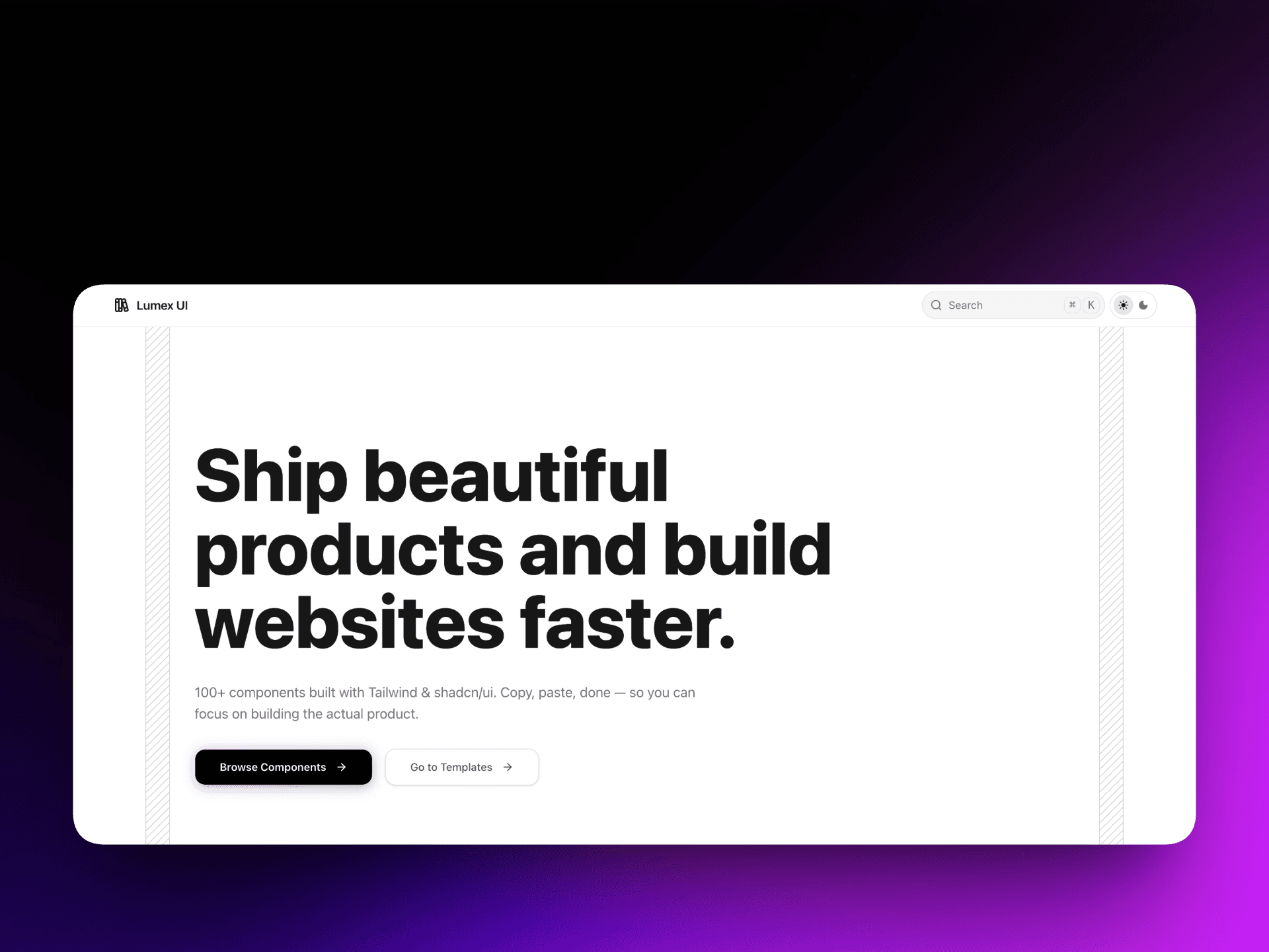
Lumex UI
A modern React component library with a shadcn-style registry and Fumadocs-powered documentation site.
Timeline
1 Month
Role
Library Author & Designer
Team
Solo
Status
In ProgressTechnology Stack
Key Challenges
- Component Registry Architecture
- Documentation Site Design
- API Consistency Across Components
Key Learnings
- shadcn Registry Pattern
- Fumadocs Integration
- Open Source Library Design
- Developer Experience (DX) Thinking
Overview
Lumex UI is a open-source React component library designed for developers who want beautiful, accessible, and customizable UI components — without sacrificing control over their codebase.
Inspired by the shadcn philosophy of owning your components, Lumex UI uses a registry-based distribution model where developers copy components directly into their project rather than importing from a black-box npm package. The library is paired with a fully-featured documentation site built on Fumadocs, offering live previews, installation guides, and copy-paste ready code snippets.
Key Features
Features Implemented
- shadcn-style Registry: Components are distributed via a registry — developers run a CLI command to add only what they need, directly into their codebase
- Fumadocs Documentation: A fast, MDX-powered documentation site with live component previews, syntax-highlighted code blocks, and a clean navigation structure
- Tailwind CSS + Radix UI Foundation: Components are built on accessible Radix UI primitives and styled with Tailwind utility classes
- Copy-Paste Friendly: Every component page includes a ready-to-use code snippet with zero configuration required
- Theming Support: CSS variable-based theming that integrates seamlessly with any existing Tailwind project
- TypeScript First: Full TypeScript support with exported types for every component and prop
Architecture
Registry Pattern (shadcn-inspired)
Rather than publishing to npm and locking developers into a dependency, Lumex UI uses a component registry — a JSON-based manifest that maps component names to their source files. When a developer runs the add command, the CLI fetches the component source and writes it directly into their project.
This approach gives developers:
- Full ownership and editability of every component
- No version lock-in or breaking change anxiety
- A starting point they can customize freely
Documentation with Fumadocs
The documentation site is built on Fumadocs, a Next.js-native documentation framework. Each component page is authored in MDX and includes:
- A live interactive preview
- Prop tables with type annotations
- Variant showcases
- Copy-ready installation commands
Challenges
Component Registry Architecture
Building a registry that correctly resolves component dependencies (e.g., a complex component that depends on a primitive) required careful design of the manifest schema and CLI resolution logic.
Documentation Site Design
Making the docs feel premium — not just functional — was a priority. Getting Fumadocs customized to match Lumex UI's visual identity took significant iteration on theming, layout, and component preview sandboxing.
API Consistency Across Components
Designing a consistent prop API across all components (naming conventions, variant patterns, size scales) so the library feels cohesive rather than a collection of one-offs.
Learnings
- Deep understanding of the shadcn registry pattern and how component distribution differs from traditional npm packages
- How to build and theme a documentation site with Fumadocs and MDX
- Thinking about Developer Experience (DX) as a first-class product concern — docs, onboarding, and copy-paste ergonomics matter as much as the components themselves
- Designing a consistent, scalable component API from the ground up